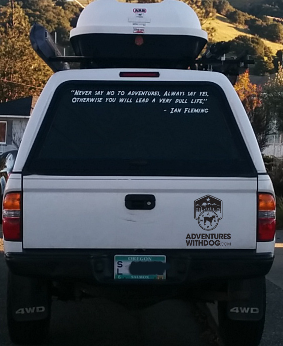
Now that we have our new logo just using it on the website is not enough. Our old, simple advertising on the Tacoma was just our amateurish showing of the plain URL in an interesting font on the rear window of the camper shell. Since certain people have a design sensibility I value I quickly mocked up some logo placement options and sent them out for feedback.


Now that the amateur (me) had proven my lack of taste and design sensibility again the professionals got back to me and were gentle in their complete disregard of my non-painstakingly-crafted mock-ups.

So this lets me keep the quote and not overwhelm the rear window area with a big, garish logo.

After the vulgarian (moi) and the two professionals reached a consensus (alright, I caved) I asked the people who had made my text vinyls if they could produce these new logos as well. I felt like I knew what I was talking about when I told the lady that I had both Raster and Vector formats and which of those would she prefer. They were happy to do so (send us the Vector please) and, even during the holiday season, got them out to me in the mail in less than a week. We chose two of the logos in black at 12″ high for the sides of the Tacoma and one logo in white at 14″ tall for the rear window. The Fleming quote was sized to fit vertically between the lower edge of the tailgate handle and the bottom of the tailgate itself.
Over the course of a couple of hours one of my design-oriented friends helped me apply these logos on the areas of the truck deemed “correct” by the professionals. There was the use of a tape measure, blue painters tape and a bit of soapy water in case we needed to make some minor adjustments. Once everything was measured twice and lined up the pieces were laid into place, the backing sheet was removed and the sheet holding the actual vinyl letters was pressed against the surfaces. Once everything looked good we then carefully peeled of the backing leaving only the vinyl letters and logo behind on the Tacoma.


 So now we are officially out of stealth mode and actively marketing our site as we drive along public roads. We have observed that a greater number of people seem to do double-takes and smile as they pass us than seemed to do so before we applied the new logos and quote.
We think it looks nice and professional. The main downside is that now we can no longer actively point out the errors of people’s piss poor (driving) habits when we encounter such all-too-often mediocre driving abilities. Hopefully this forced non-confrontational stance and resultant lowering of my blood pressure will make up for the loss of cathartic bliss during honest, corrective interaction 😉

Looks good and especially like the quote’s placement on the tailgate. Looking forward to more adventures.