As of November 2016 we’ve been “doing” Adventures With Dog for a whole year now. For that first year we wanted to focus more on getting some content up and adding to our collection of adventures and less about marketing the site. To that end all I had was a vinyl sticker of our URL on the rear window of the camper shell.

Since the glass was tinted the sticker did not stand out and it was really hard to see unless you were actively looking for it which was sort of the idea, a “soft launch” if you will. When November rolled around and we had added well over 100 posts and 150,000 words we decided to “come out of stealth mode” as they say in Venture Capital circles. I was originally content to just switch out the black vinyl for white and call it good but decided to first contact a friend, Brian, who is a designer among other talents and ask his opinion about which font (or font family) would work best on the camper shell glass to be seen and easily read at highway speeds etcetera. As a bonus he and his girlfriend are also the ones who originally found and rescued Willow on the side of the road back in 2010 so he has a bit of a vested interest in my girl’s adventurous life.
He works way beyond full-time doing many more important jobs than this for repeat clients such as Google, Facebook, Citrix, Box, Microsoft, Adobe and Intel to name drop just a few and could, understandably, not respond immediately. As my need for instant gratification was going unfulfilled, I made the executive decision to just order a new vinyl sticker in white right now. This time though I chose the Adventure font both because of the name and because it looks good and active with a hint of comic fun in it.

I felt much better. He could bust my chops later for whatever less-than-stellar choices I just made. I also decided to get one of our favorite quotes printed in vinyl as well so as to hopefully get people to read it, smile at the wisdom of it and then see our URL. If you’ve seen our Quotes page then you know we had many options. For this purpose though some were overly wordy and would have been hundreds of dollars to get printed so those were off the table. Three options eventually presented themselves and we finally decided on the quote about adventures from Ian Fleming:
“Never say no to adventures. Always say yes,
otherwise you will lead a very dull life.”
The 1st runner-up was by Immanuel Kant: “We can judge the heart of a man by his treatment of animals” and the 2nd runner-up by Sir Ranulph Fiennes: “There is no such thing as bad weather, only inappropriate clothing.” Either of these I can easily have made at a later date if I want to change things up a bit. I went online and made my order and then, literally no more than an hour later, my friend e-mails back and offers to create a logo for us. Damn my need for immediate gratification 😉 But, oh well, these new vinyls would just have to be a place holder until the logo came to fruition.

Now showing up well in the white we regularly see people doing double takes and smiling when they pass us while driving so this is doing its job for the time being.
No more than a day later my talented buddy got back to us with his first logo idea.

I liked the font choices and the tennis ball for the Dot but the dog looked a bit too stumpy-legged. A bit too “Beagle-like” for my tastes. It didn’t have to literally represent Willow but, if we could make the legs just a little longer it would be a pretty good approximation of her in silhouette. He asked for some pictures of her in side profile and I eventually sent him a handful for his perusal.
About a week passed with no word and then I received an email with these two versions attached:

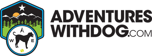
He explained that the design incorporated several “Easter Eggs” including the W and E on the compass representing Willow and Eric (as well as West and East). The star is the North Star and the sun is rising/setting behind a snow-capped mountain range fronted by a forest, two environments we spend a lot of time in. My response again was “Cool, Thank You. I like it but….”
My major issue was the dog being white as Willow is the opposite of white. I did a quick and ugly inversion and sent him back this.
 So, yes, the dog is now black but the mountains look like they are not snow-covered but topped with a coating of oil or coal dust and the sun is now the moon or some black horror coming to obliterate us all so….
My friend fixed those issues and sent me back the third version with all those little tweaks incorporated as well as in three color versions.


Okay, now we are getting close, but….
The only issue I had with these was that the big dot representing South on the compass was just kind of a plain old dot but big and drew your eye to it and away from the loveliness which is the rest of the logo. He responded that yes, this was one of his concerns as well but he needed some ideas for what to replace it with. A Squirrel to represent S (get it, Squirrel?) was floated.

We thought is might be a bit too busy if it was detailed enough to be recognized as a squirrel and not, say, a rat or mouse. Willow wouldn’t care either way as all those rodents are fun crunchy chew toys but no, I digress. My next thought was to use a tennis ball like in the original logo concept but with the seam on the ball rotated so that it approximated an S and I sent him this to illustrate my thought:
 The next version incorporated that idea and was so close to our final version as to be virtually indistinguishable to all but the most astute observer (that includes me as well).

Let me know if you’ve heard this before, “I like it but….”
This time the tennis ball was just too big. More like soccer ball-sized in relation to the dog silhouette. That got fixed in the next version.
 Now it is not strictly tennis ball sized, more along the line of those large Chuck-It Ultra balls but more than good enough plus it is in the same size range as the other compass points. Last but not least we finally got the ball rotated just a bit so that the seam was more vertically situated like an S.

Now that we were finished with the process I was given a zip file with all the different versions of the logo in both raster and vector formats. With this new, professional logo in hand I absolutely shudder at the thought of all the time we spent flaunting our amateurish text and the untold number of people with some design training or sensibility who saw us and inwardly laughed or cringed. Okay, I’m over that now. Onward and upward.
Looking back on the process I see that Brian and I exchanged exactly 42 emails discussing all these options and iterations over about one month. There were some text messages back and forth in there as well. Some of those email threads had another designer friend in the loop giving his input as well. Others were me asking dumb design or printing questions and him patiently answering them. I can only hope the headaches I caused him were few in number and weak in severity.
Had I been a stranger off the street the cost of this service would have been far out of our reach but as a friend and an integral and vested part of Willow’s life he gave us the stupidly-generous rate of FREE! As an insignificant “Thank You” and because I found the whole process interesting I wrote this post and am happy to link to his website behrensgroup.com so that you too can see the diverse range of his talents and services available.
